One BK. One clearer identity.
We refined BK's visual identity and built a new website that brings the group together under one clear brand. The result is a more cohesive and modern BK, with an identity and digital platform that make it easier to understand the breadth of what they offer and who they are.
BK has evolved from a traditional printing company into a broad competence and production house with services across packaging, print, promotional products, signage, decoration, logistics and technology.
As the business grew, the brand also became more complex. Multiple companies, many services and different visual expressions made it harder to communicate BK as one unified company. There was a need for a clearer visual direction and a website that could make the breadth of the offering easier to understand without losing the history, expertise and personality already embedded in the brand.
The assignment therefore became bigger than redesigning a website. We needed to find a clearer way to bring all of BK together and present it as one.
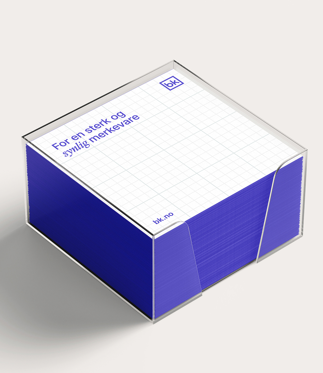
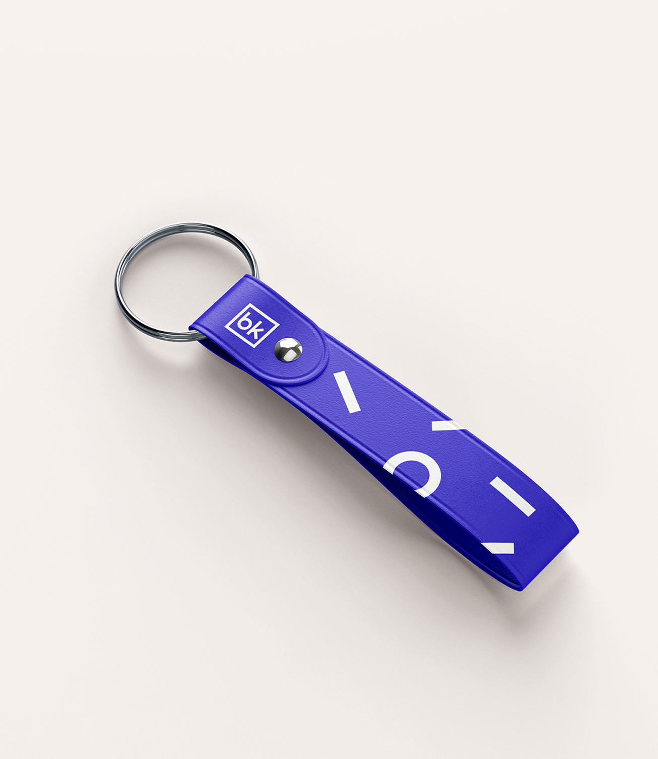
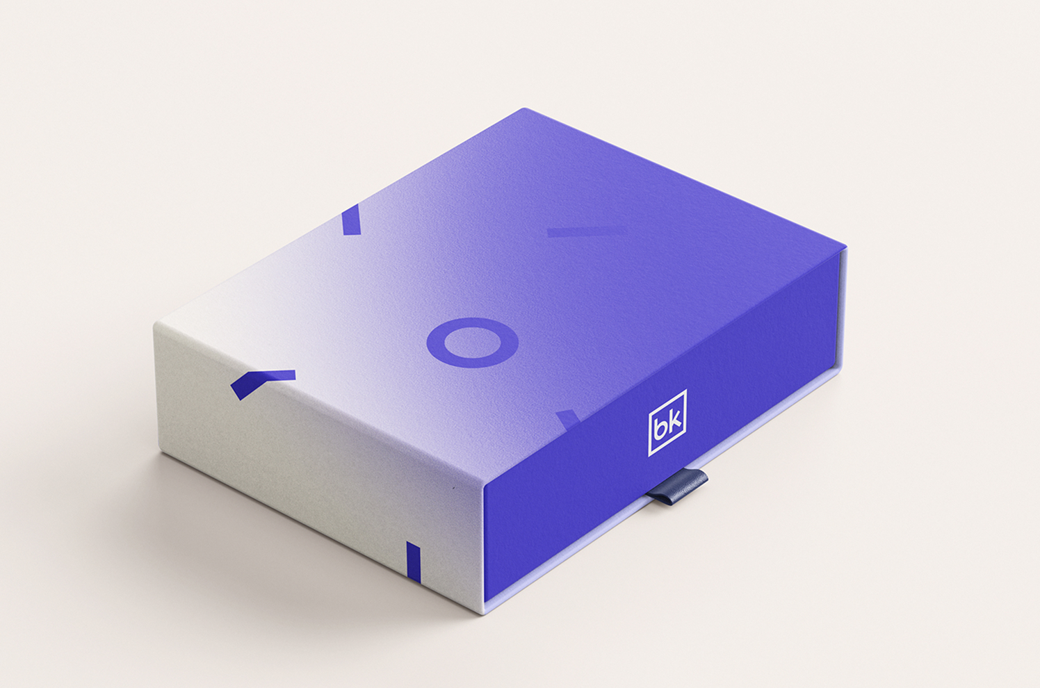
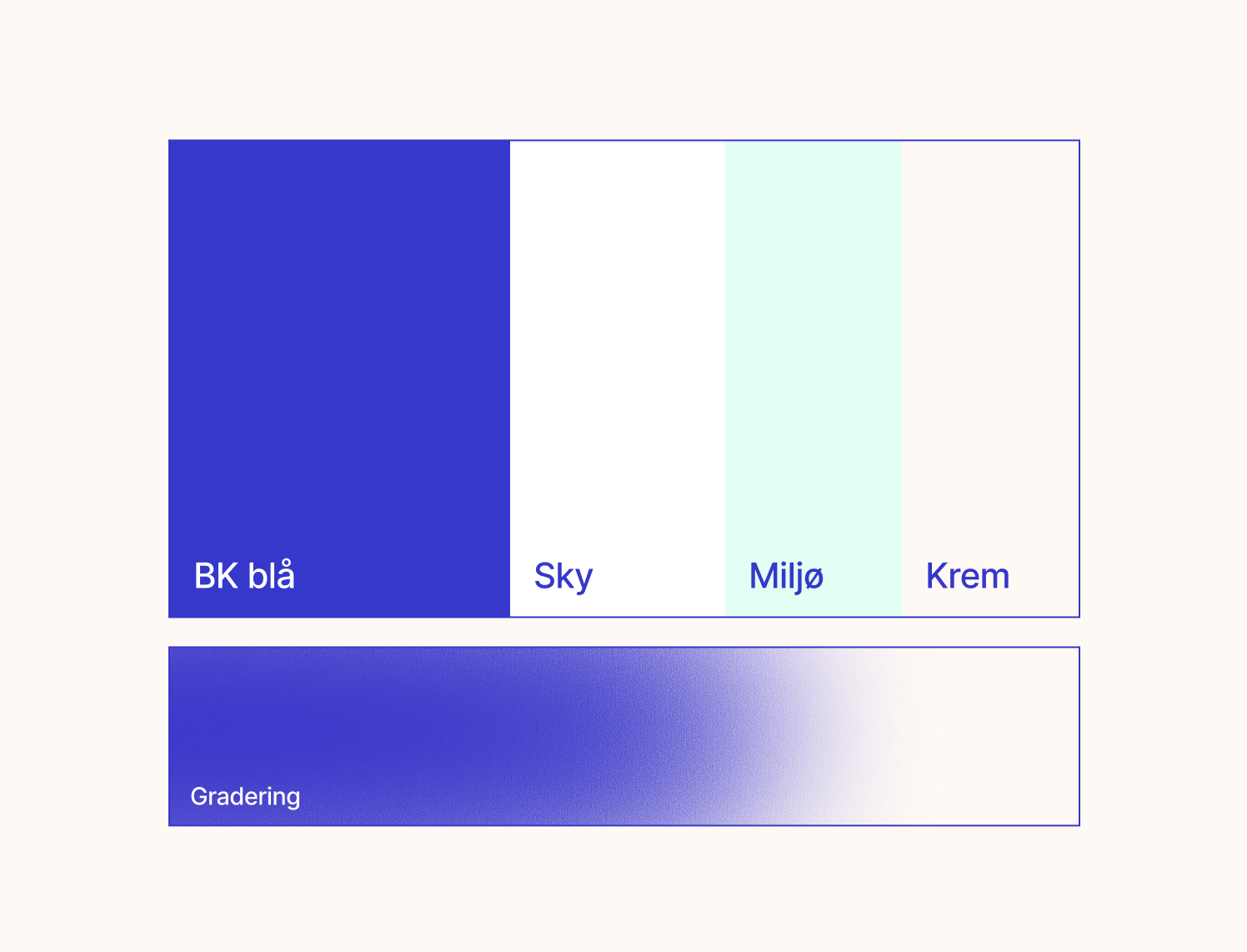
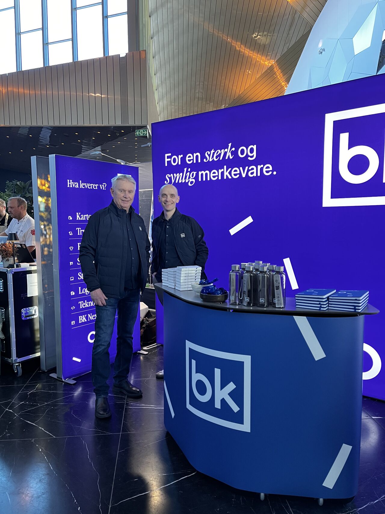
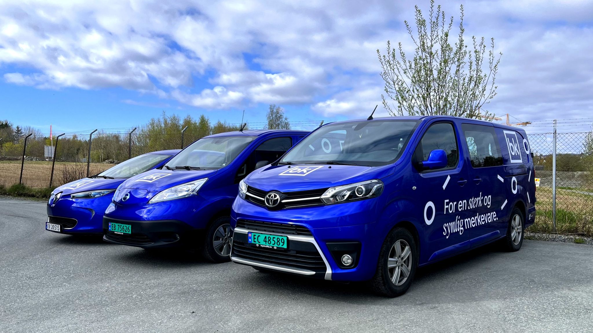
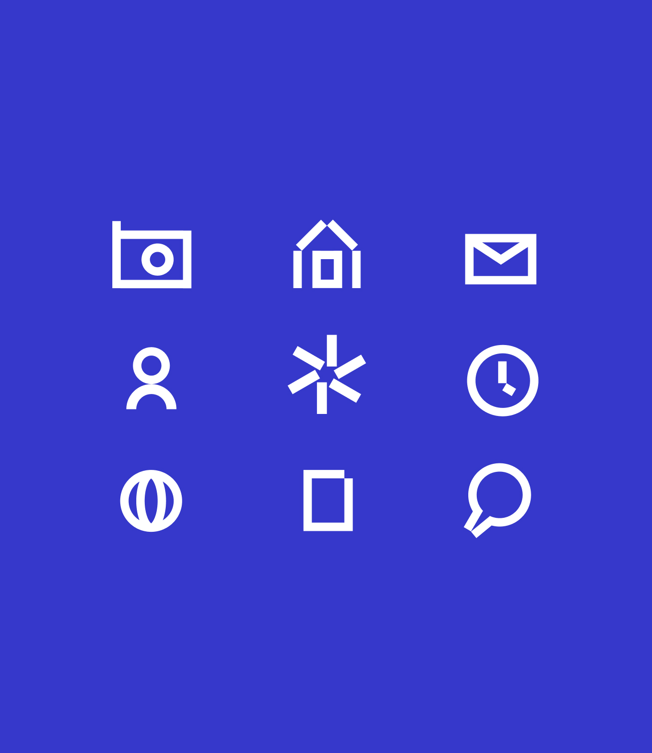
We started with the brand and developed the existing expression rather than starting over. The BK logo was retained, while we built a clearer visual system around it with a more focused colour palette, new typography, graphic elements, imagery and principles designed to work across both digital and physical touchpoints.
At the same time, we developed a new communication direction centred around the payoff “For a strong and visible brand”. It describes both what BK delivers and the value they aim to create for their customers.
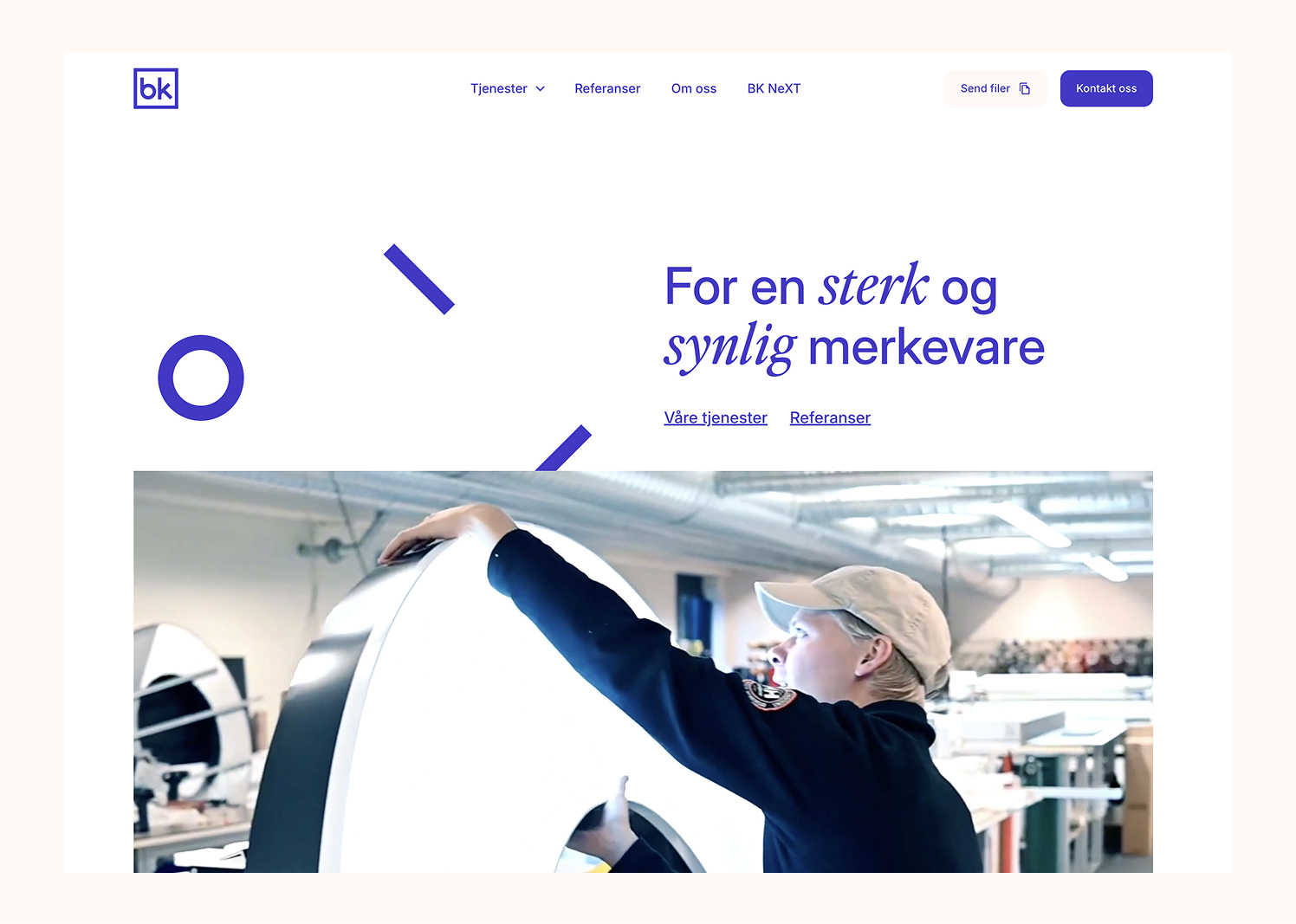
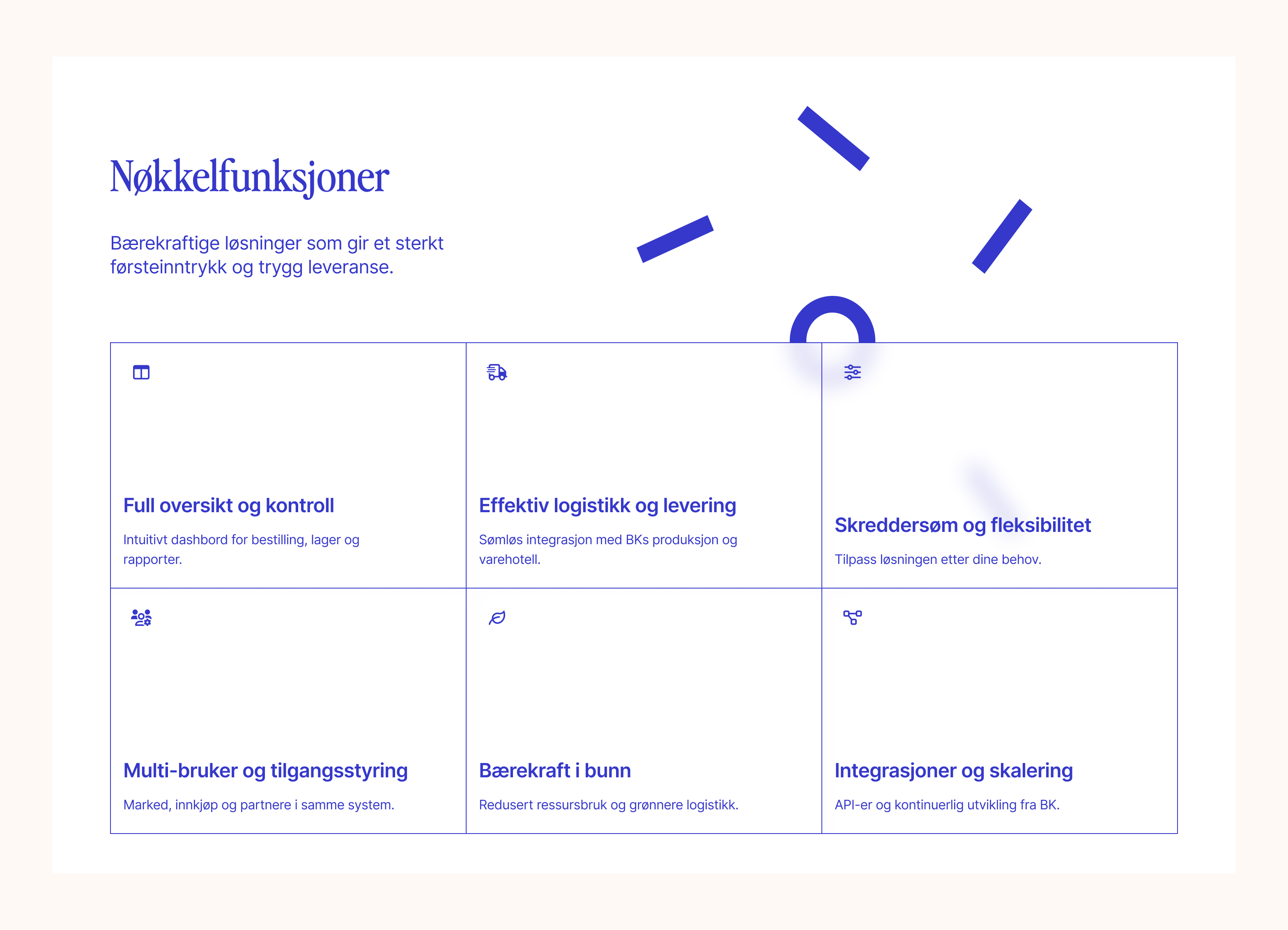
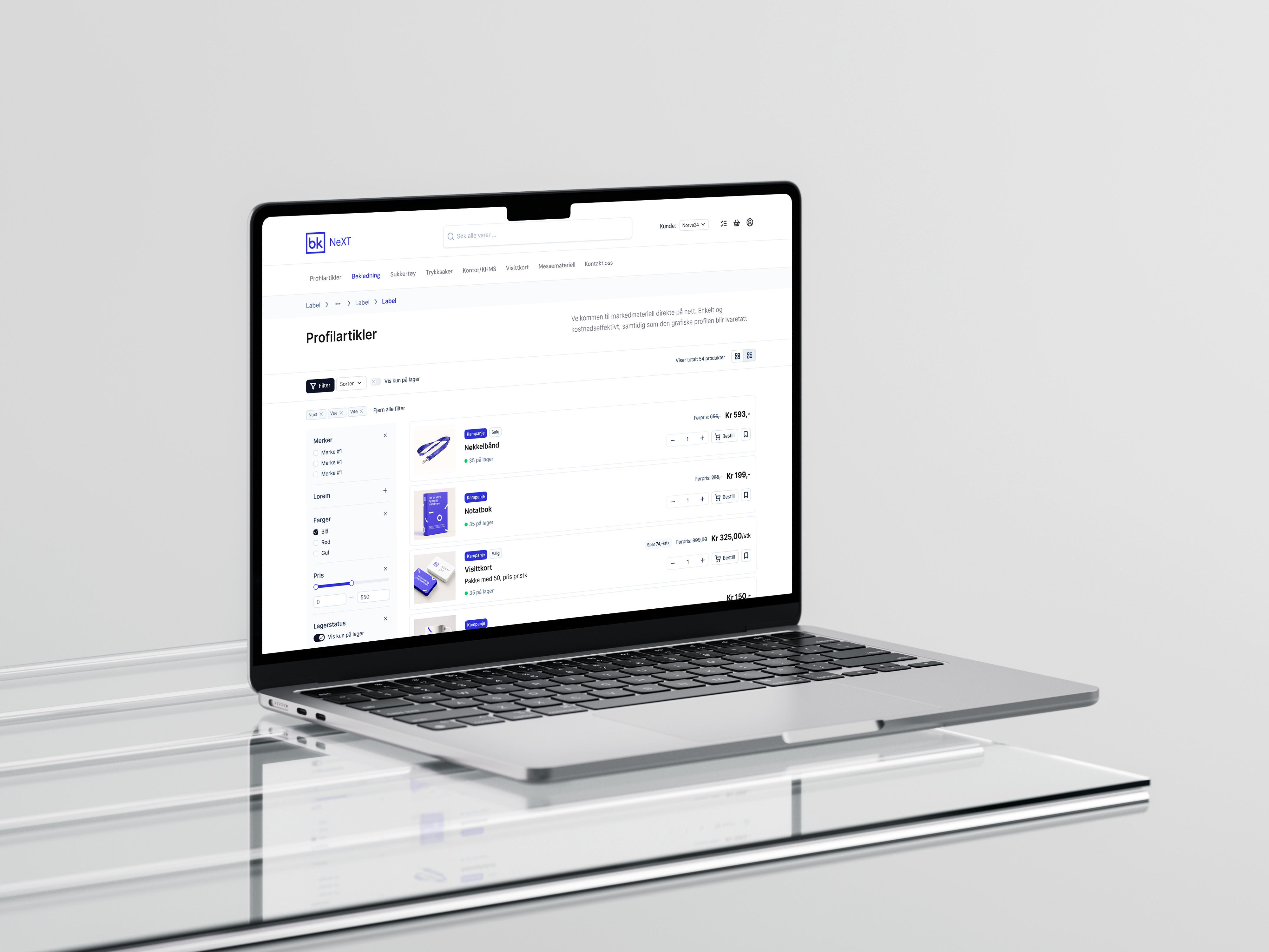
The new website was developed in parallel with the identity. We worked with structure, content, UI and UX to make an extensive service offering easier to navigate and understand. Large visual surfaces, dynamic content and details from BK's own production also help communicate the scale and expertise within the organisation.
The website was built in Webflow as a flexible system that BK can continue to work with themselves, using components and templates that make it easy to develop the content as the business evolves.
We have worked with Øyvind and Robin for many years and recommend them wholeheartedly.
Two highly skilled digital designers with an eye for detail, UX and precision. They stay current, work efficiently and professionally, and bring the energy needed to deliver design that both clients and users appreciate.


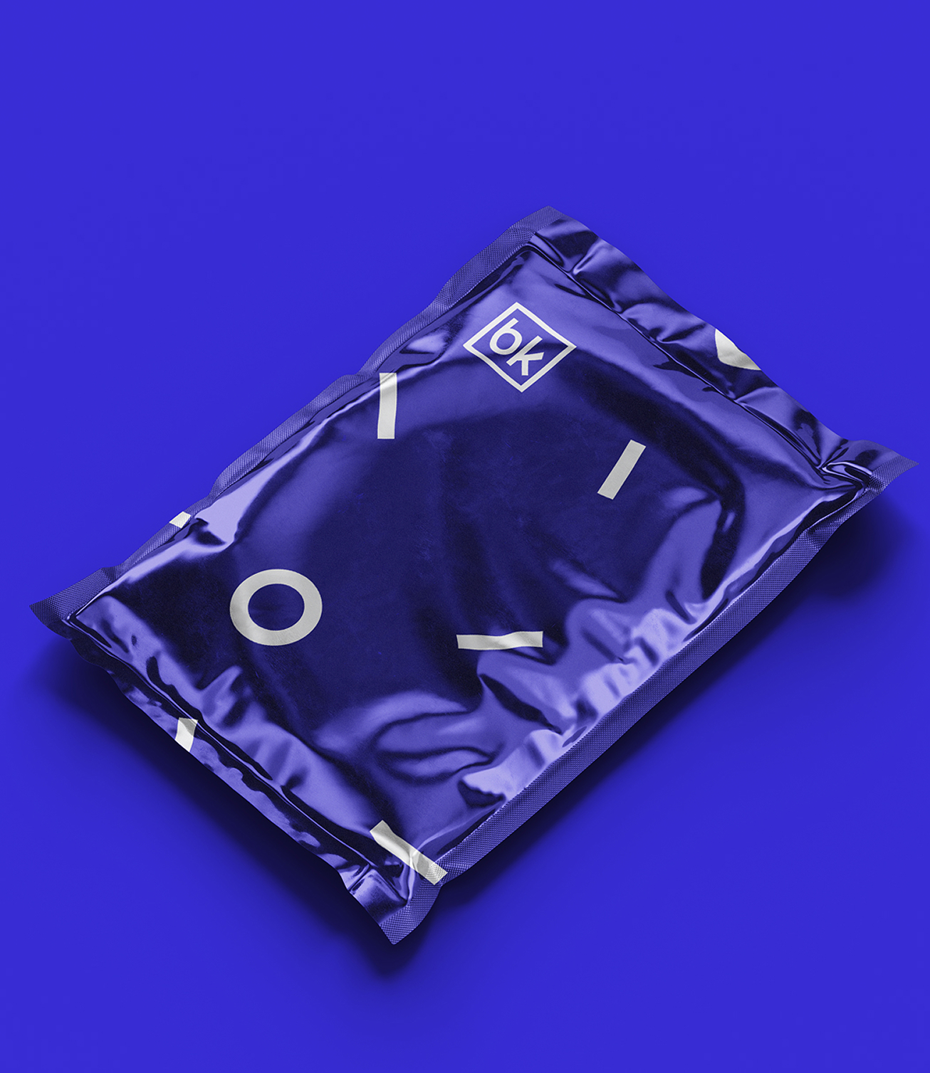
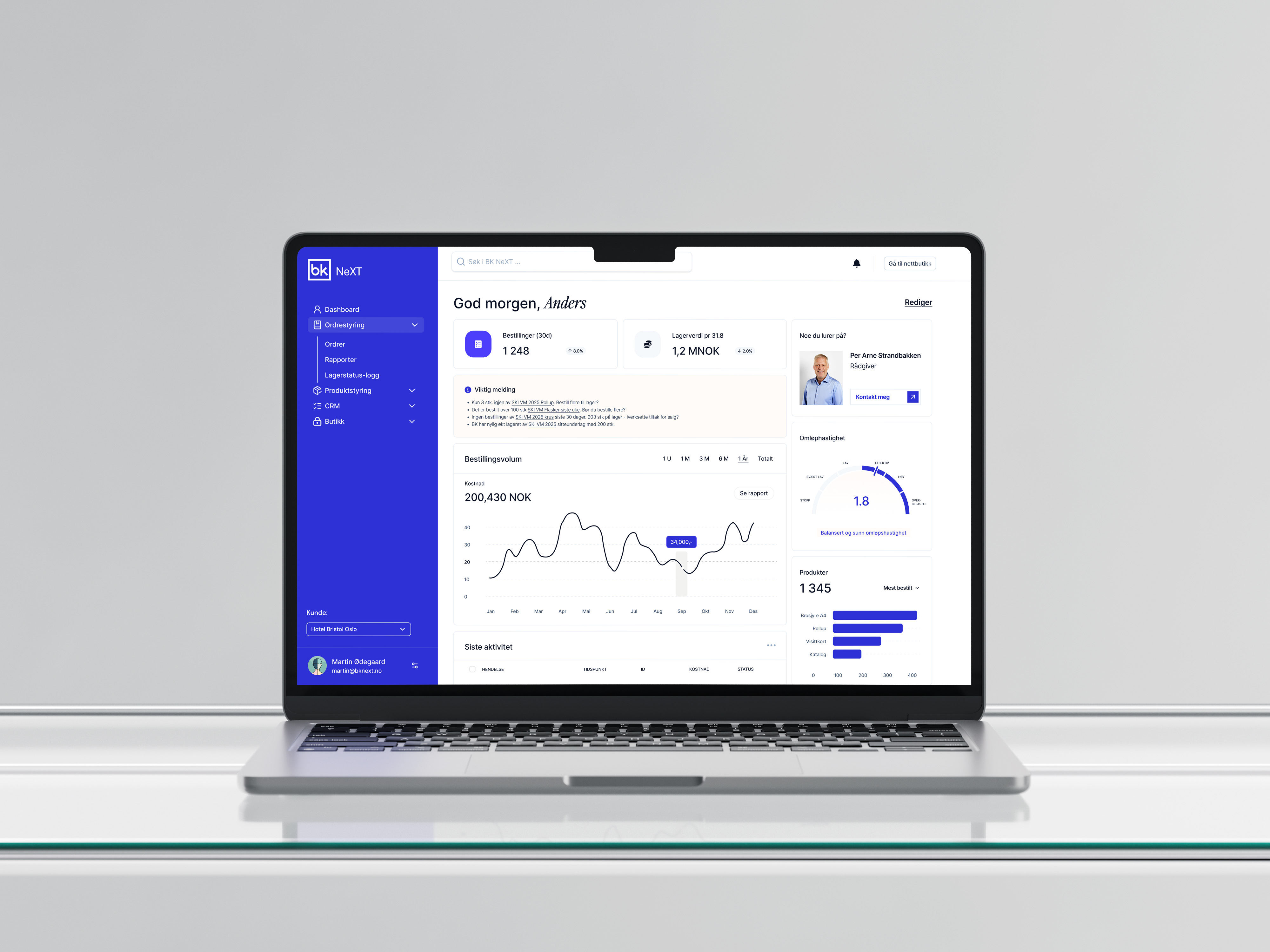
The result is a BK that feels more unified, clear and recognisable across companies, services and touchpoints.
The visual identity gives the group a shared framework for future communication, while the website makes it easier for customers to understand what BK can deliver, from a single production job to larger, integrated deliveries.
The project was also especially personal to us. Both Øyvind and Robin previously worked at BK, and this is where much of our interest in digital design and Webflow development began. Coming back and helping shape the next chapter of BK's brand made the project particularly meaningful.